CSS Grid Tracks
In CSS Grid, rows and columns are called grid tracks. Each row or column is a track.
Columns → vertical tracks (top to bottom)
Rows → horizontal tracks (left to right)
When you use grid-template-columns or grid-template-rows, you are defining grid tracks.
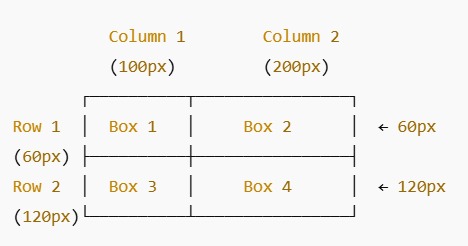
Box 1
Box 2
Box 3
Box 4
Here, Box 1 and Box 2 occupy the first row (horizontal track), and Box 3 and Box 4 occupy the second row. Column 1 and Column 2 are vertical tracks. Grid tracks help organize content neatly in rows and columns.
| Property | What it does | Example | Effect / Visual |
|---|---|---|---|
| display: grid; | Makes a container a grid | display: grid; | Boxes are aligned in rows and columns |
| grid-template-columns | Defines the number & width of columns | grid-template-columns: 120px 160px; | 2 columns → first 120px, second 160px |
| grid-template-rows | Defines the number & height of rows | grid-template-rows: 50px 100px; | 2 rows → first 50px, second 100px |
| gap | Space between rows & columns | gap: 6px; | Boxes have small spacing |
| padding | Space inside container | padding: 10px; | Inner spacing of container |
| border-radius | Round corners of container | border-radius: 12px; | Container corners are rounded |
| box-shadow | Add shadow around container | box-shadow: 0 3px 6px rgba(0,0,0,0.05); | Container appears slightly elevated |
FAQ – CSS Grid
Grid tracks are rows and columns. Columns are vertical tracks, rows are horizontal tracks.
Grid is a 2D layout system (rows + columns) while Flex is a 1D layout system (row or column). Use Grid for layout, Flex for alignment.
These properties define the number and size of columns and rows, i.e., the grid tracks.
The grid gap property adds space between rows and columns without using margins on grid items.
auto-fit collapses empty tracks, while auto-fill keeps empty tracks in the grid layout.
Grid lines are the lines that separate rows and columns. They are used to place grid items precisely.
Use the properties grid-column and grid-row with start/end numbers or the span keyword to stretch items across tracks.
grid-template-areas allows you to name sections of the grid and place items using these names for cleaner layout code.
The fr unit represents a fraction of available space, while minmax() sets a grid track's min and max size for flexibility.
Yes! Use Grid for the main layout structure and Flexbox for aligning items inside individual grid cells for more control.